 Skip to content
Skin and Bones: what color and value provide a painting
In this short article, I want talk about the skin and bones of a painting. One time, in the middle of a conversation about a painting, I once said, “This painting has good bones.” The person with whom I was chatting asked what I meant by that. I answered, but it was a muddled answer. If I could rewind time and re-answer, I’d say, “It means that the painting has a solid value structure.” The value (lightness and darkness) of a painting provides the skeletal structure of the painting. And if “Value” is the bones, “Color” is the skin.
What does your body need more: skin or bones? Of course, we need both! But humor me for a second: imagine if you just had skin but no bones. You would be a gushy blob with accurate skin, hair and eye colors, but you wouldn’t be recognizable. Now imagine if you had bones, but no flesh. You’d be your exact height and shape – legs, arms, head, trunk — but not very huggable, nor very recognizable!
Some Visual Examples:
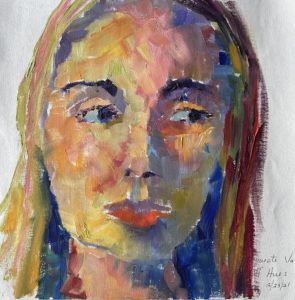
I painted this portrait of my daughter during the early days of Covid lockdown. I don’t paint many portraits. So, this painting is doubly special to me, because not only is it one of my rare portraits, it’s the only one so far that I’ve signed, “Mom”. (I’m still trying to convince my son to sit for me.)

“Megan”. 18″ x 24″. oil on canvas. NFS.
I was wondering which is more important – Value or Color? So I did a couple of studies based on this painting to experiment. Sometimes the best way to see the importance of something is to remove that thing and see what happens.
I started by tracing my daughter’s face from the original painting onto two canvases so that the proportions/drawing in each study would be identical. The first study has accurate value, even though the color (hue and saturation) is off-kilter:
“Study of Megan–value on, hue off”. oil on canvas. NFS. (Note: this is a hastily painted study – for experimental purposes only. Interpretation: I know it’s ugly.)
In the above examples, when we removed the accuracy of color but left the value in place; the color got wild, but the structure of the face remained intact. Therefore, we can assume that the value is what gives a painting structure—just like bones give our bodies structure.
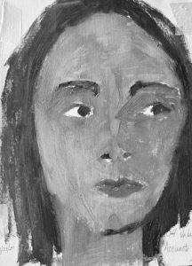
Now let’s experiment see what the second study looks like. Remember, it’s the opposite of the first study, it has (somewhat) accurate color, but not at all accurate value:

“Study of Megan–hue on, value off”. oil on canvas. NFS. (Note: this is a hastily painted study – for experimental purposes only. Interpretation: I know it’s very, very ugly.)
This study was quite difficult for me to paint (and also share with you) because I know better than to flatten values. It made me twitchy. I still needed to use values in some places just to delineate shapes (nostrils, top vs. bottom lip, under chin, etc.) However, I tried to screw up the values so that the experiment would still work.
In this study, when I removed accurate value but left the color intact, the image flattened out, and it became a symbol of a face, rather than an attempt at representation.
To be able to see the values even more clearly, here are the same two studies side-by-side in black and white:.
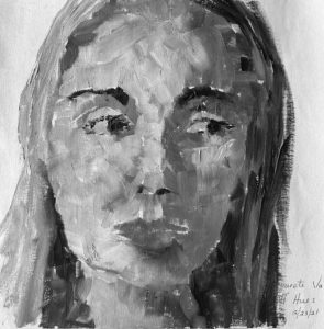
Once turned black and white, the study on the left might actually look better with the super-saturated colors gone. It still has depth (and could have had more, if I had taken the time to fully develop it). The study on the right looks just as bad as the color version, if not worse. It lacks the underlying value structure…the bones upon which the entire painting should be built.
There is a phrase that I hear my artist friends use often: “Color gets all the credit, while value does all the work.” It sounds like a quote from a famous artist. However it is said so often and without a quotation, that I have no idea who said it first. However, it is very true. In fact, I think the sentiment could be pushed even further by saying, “Color demands all our attention, so we can’t see that value is doing all the work.”
Three Methods for Seeing Value (by limiting color)
If you want an accurate picture of what value is doing, you need to find a way to temporarily hide the color from your eyes. I do this all of the time when I’m painting by using one or more of these three methods:
- Modified Squinting – Try this: Gently lower your top lid about 97% so that you’re looking through your lashes. You should see general areas of light and dark shapes with subtle colors – no sharp detail, no intense colors. The nice thing about this method is that you don’t need any special tools to carry around, we always have our eyes with us (hopefully!) But until you get used to it, it can be hard to trust the ethereal picture you vaguely see. (Note: this is not squinting where you’re squeezing both your top and bottom eyelid. Real squinting actually changes the shape of your eyeball, and may help you see clearer, if you need glasses. We’re trying to see worse so that the color gets reduced.)
- Value Finder – This is looking through a small piece of colored glass or plexiglass. The one I use is red, however, I’ve seen green versions as well. The main purpose of doing this is to turn everything the same color so that we no longer pay attention to the many colors, but the values instead. I keep a small value finder in my main plein air easel and another near my studio easel. They’re a quick, cheap, low-tech way of being able to see and compare values.
- Phone Camera – Use your phone to take a photo of whatever you want to see black and white by editing the photo. Here’s how with an iPhone: take a photo with your phone. Find your photo in the gallery and open it. Click the blue word “Edit” in the upper right corner. Once in edit mode, go to the color options. (This is the icon of three interlocking circles.) Then scroll until you see “Mono” or “Silvertone” or “Noir”. These all are basically a black-and-white version of your image.
Just like our bodies need both skin and bones to function well and look like ourselves, paintings need both value and color for structure and distinctiveness. Color is very exciting and can attract all of the attention. But when enjoying paintings, be sure to take a moment to look past the color. Use one of the above techniques to help you have “X-ray” vision and see the bones–i.e. the value structure–underneath.
To find out what I’ve been up to lately, click here to read my Goodbye-to-Fall 2022 Newsletter.
Skin and Bones: what color and value provide a painting Read More »
